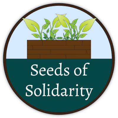
In week 7, we decided on which mockup to use, and started designing the top-level pages of the site. I went with Mockup #1, and wrote out a Style Guide to follow. I also reworked the logo into something that could be used more widely throughout the site.
I chose Mockup #1, because both the layout and design felt less heavy, and the colors were more nature-centric. Mockup #2 had a nice apple red, but it felt more aggressive in comparison. Seeds of Solidarity's content came across to me as more focused, but relaxed. I wanted something that echoed a clear sky and the green of new seedlings in the ground, with a layout that wasn't afraid to use empty space.
