Web Development

Week 6: 10.4 to 10.10


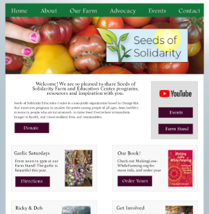
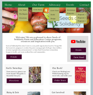
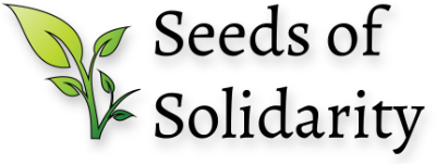
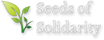
For Week 6, we focused on taking the wireframes we made for the home page, and developed two different mockups, with colors and images. We were also asked to develop ideas for a logo, and make a few versions that could be used in different contexts on the site. I used Photoshop to make both mockups, and Illustrator for the different logo options.
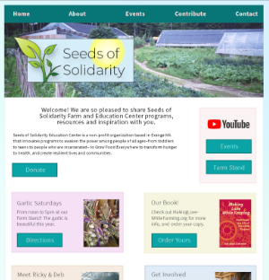
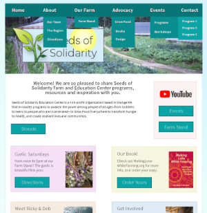
mockup 1, which has more blue and green colors, for the home page of seeds of solidarity mockup 1, with the nav menu fully expanded so you can see the directory structure
mockup 2, which is more red and gray in tone, for the home page of seeds of solidarity mockup 2, with the nav menu fully expanded so you can see the directory structure
the seeds of solidarity logo, with black letters and a leaf graphic to the left the seeds of solidarity logo, with white letters and a leaf graphic to the left