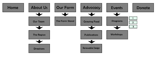
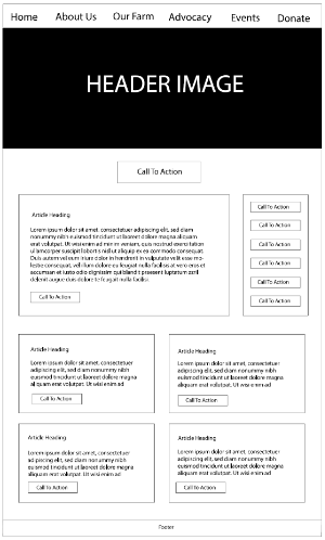
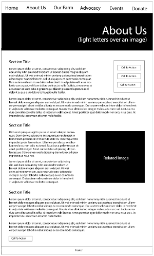
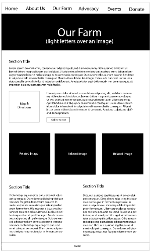
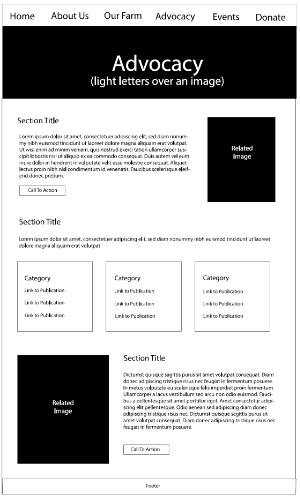
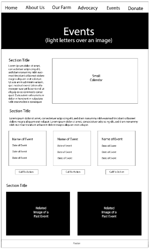
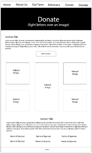
For Week 5, we worked on developing the site map and wireframes for our reworked sites. I created the wireframes for the 6 top-level pages using Illustrator, and made a graphic for the site page using Photoshop. This allowed us to take a first attempt at reorganizing the information those charities had wanted to present, and get feedback from the rest of the class on what passed their useability-focused impressions.
With the wireframes, we were to focus on what content we wanted to present, and how the spacing would work. This helped me really consider if my initial ideas regarding the site layout would lead to properly laid out pages. The content needs to guide how the site looks and works, and ultimately any clever ideas about the design will only work if the context exists to fill in the layout with.
