For this week, we were tasked with taking an existing website and designing a mockup of how we would improve the useability and layout of the site. I decided on Seeds of Solidarity, because I read how they grow garlic and had a farm stand, which made me interested in maybe driving out to visit.
To start, they have a lot of very interesting content, and definitely should have a website, but it is almost passive in how it is laid out. It's hard to find quickly what the actionable items are, where they would want to direct someone's attention. The current version looks more like a blog, than the face of a non-profit that is an active part of their community. If there were time-sensitive items, like a seasonal event or a donation campaign, it should be the first thing I see, but instead I need to hunt for them.
The colors they've chosen are good, but they are in areas that I don't need to pay as much attention to. The strongest color impression is the background, whereas the text and links are more muted and I don't look at them first.
A good front page should give you the basic details within the first 30 seconds or so. As far as I can see, these are the highlights for this organization:
- Who: Seeds of Solidarity Farm and Seeds of Solidarity Education Center, Inc.
- What: a Farm that grows and sells fruits and vegetables, as well as a charity that teaches people how to grow your own food, with outreach primarily to schools and low income families.
- Where: 165 Chestnut Hill Road, Orange, MA 01364
- When: The farmstand is open daily, April to November. They have an events calendar and can be asked to come to give presentations at schools regarding growing sustainable food at home.
- How: The nonprofit supports the farm, and vice versa. There are community partnerships and a small group of people who work on the farm and in the nonprofit.
I would start with recommending simplifying their message to one primary thing that they want to engage people with, and have that be the main call to action. Most major charities get people's attention by talking about one main concept or problem that they can direct their energy toward. It's usually something that can be made better, by the person's quick and simple efforts, such as donating food from their pantry, or making a small donation to buy medicine.
This is an organization that gives freely without specifically asking for help with a goal they are working towards. While this is admirable, maybe it would help to have a campaign where they engage people with something targeted, like helping them reach a certain number of schools with their own gardens.
This targeted item would be front and center, either over the header image, or right underneath it, so that it gets line of sight. Then, because this organization has several other things of interest, a section on the side with other calls to action would be useful. An article explaining the main cause, with some more detail and a repeated call to action would be good, with a section below that for more detail on seasonal events, youtube videos, or other ways to be involved and support.
This is what I've tried to keep in mind as I've thought about the layout. From what I can see, the top level items of interest are:
- Their farmstand location and hours
- A phone number to contact
- The videos on their Youtube channel
- Receiving financial contributions from their community
- The social programs they support
- Their newsletter and book, along with other materials
- Any seasonal or upcoming events at the farm or stand
If I were doing a complete redesign and they felt we were on the same page with what the items of importance are, I would build the front page with those highlights and then try to consider how the internal pages should be structured to still support and visually remind users of the main calls to action.
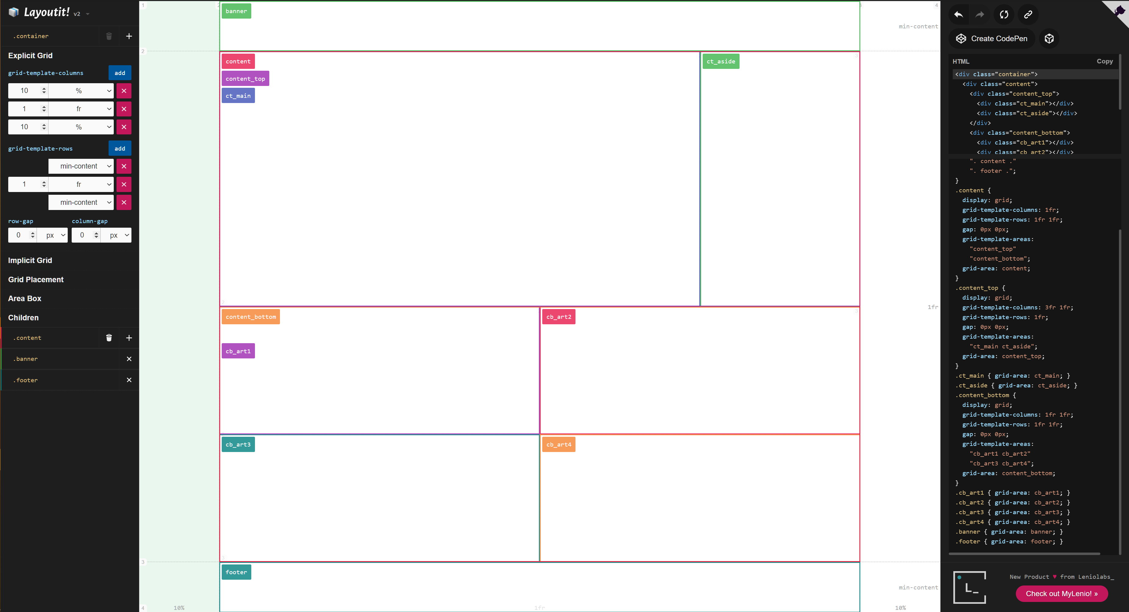
Here is my live mockup with all that in mind. Also, here is a screenshot of the grid layout for the basic page structure that I went with.