Screen Design Project Writeup
by Harmonie Snow
What style or mood did you use to focus your design (e.g., futuristic, classical, brutalist, playful, modern, skeuomorphic, business-like)? Find the correct adjectives and be sure to explain the rationale for the design strategy that you chose.
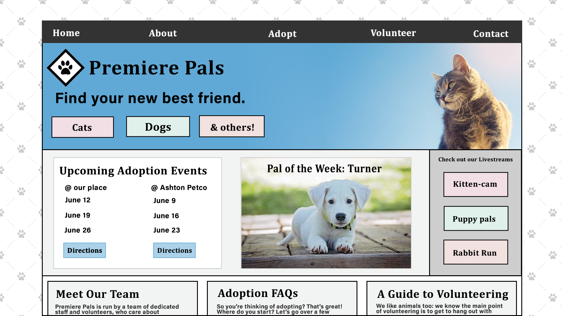
Playful is actually a good word to use for this one. The first design I thought of was a pet adoption agency. Even though this is a commonplace business, I wanted to put my own take on it. I wanted to first have something with a clean look, not a lot of other colors, so that the photos of the animals were able to take focus.
That's also the tone of the site: light mood, friendly, casual, but excited. I pictured someone playing with a bunch of puppies, just having a silly time and that being their only focus. So I considered what things would support that vibe and decided to go with pet cams, volunteering (come spend time with animals), and adopting a “new best friend”.
Explain who is the intended user is (e.g., gender, age range or group, hobbies, purpose).
The intended user would be someone who has a home and is looking to adopt an animal, gender and age being perhaps factors, but not ones I focused on. I tried to keep the design colors genderless, and still interesting enough to appeal to younger and older folks alike. This was also meant to appeal to people who like volunteering, because the business also benefits from a community of people who may not be able to take a pet home, but can help out and benefit themselves from some time hanging out with a friendly cat or dog.
Lastly because there are people who just like to watch animal live streams, I've added that as well. These may not be direct customers, but they'll share the streams and help bring in other word of mouth attention. It's a good promotion for the animals too, and can help more of them get adopted.
What about typography? What standards did you set for the use of type? Please be sure to name the font(s) that you have chosen. Are they supported by one or more popular browsers, if intended for viewing on a browser?
For fonts, I went with Cambria for links and headlines, because it looked clean and official enough, while still seeming a little casual. The little serif accents aren't too extreme, but they're still present. It is fairly web-safe also, so it wouldn't be a problem if someone in a different country with an unusual setup wanted to watch a live stream.
For general text, I've chosen Acumin Pro, which is an Adobe font and would also be pretty universal. It's a san-serif font, and easy to read. Both fonts would be easy to read quickly, and on different screen sizes.
Explain your color strategy (e.g., warm, cool, light, dark, eclectic, complementary)?
For colors, I started out with black, white, and light grays, because I wanted the animal photos to be the most interesting things on the page. The banner I picked had a good blue in it that felt soft, but also friendly. So I based the other colors on that.
The three link buttons in the header, and on the live stream sidebar, are tetradic colors to the original blue #83bcde, and then I chose a lighter shade of each, to provide good contrast against the darker blue. For text links and buttons on a white background, I'd use the blue color (see the buttons on the “Upcoming Adoption Events” area) and for darker gray or black areas I'll use the lighter colors to provide contrast (see the live stream sidebar).
Will your screen have motion? If so, describe it in technical terms (e.g., animated gifs, mouseovers, rollovers, video, motion parallax, carousels).
I would keep the motion to a minimum, and reserve it for either a carousel of photos (have a rotating banner with an animal on the right, and color on the left so the logo and buttons still are easy to read). I would make the hover effects on links be subtle, just a small change in color or shading, so that you can tell your cursor is in a clickable area.
There would be video use, not just on the live stream areas, but also video of the “Pal of the Week” playing or sleeping, something that shows their behavior. This would be on an inner page, that you would get to by clicking on the item on the front page.
What display size have you chosen to show (e.g., older 640 pixels wide by 480 pixels high, the maximum size for a thirteen-inch monitor of years ago; 800 by 600; anamorphic, 1024 by 768, 1366 by 768; iPhone's 320 x 480; various viewport(s)/ device(s))? Will the screen be responsive? What is the real size or "live area" once menu bars, scroll bars and other controls are considered? Describe the rationale as to why you picked this size(s) given your intended audience.
For the display size, I went with 1920 by 1080. My thought was that most people who want to watch a livestream or look through lists of pets might be doing it on a desktop, but there would definitely be a need for a mobile version. The screen would definitely be responsive, so I tried to keep the elements set up in a way that they could collapse into a smaller screen more easily.
If I were coding this page out, I'd use grid and then change the layout of different items using media queries. The live streams would turn into a row instead of a column, and tuck under the banner, then the Adoption Events box, then the Pal of the Week. That gets a user past 4 key actionable items: first, do you want to adopt? It's right at the top, and also repeated on the intro image. Did you want to check out a stream? You got the links. Thirdly, are you going to one of the events? Here's the link to the directions. Are you here because you want to look around? Well then here's our spotlight Pal. If none of those things are what the user wants, then they get down to the “articles” and more detailed information that takes longer to read and interact with.
I would also reduce the margins around the outside as the page got smaller, so that most of the page would retain it's “live” status. The style that you get from the background is repeated in the logo and reused as a background element or list icon if there are any (like in the FAQs) so the design would still carry those elements on a smaller screen.
What strategy did you use for other design elements (e.g., texture, shape, thickness of line or borders if any, photographs, illustrations)? Is there a background, such as a ghosted photograph or texture? Or will it be white, black or some other treatment? Be sure to explain why.
I really liked the background image, since it felt like the type of pattern you'd see on a high-end bag, and mimicked the cross hatch effect you get on some fancy cushions. The pets aren't thoroughbreds and the prices aren't high-end, but the quality of the companionship is high and I wanted to support that marketing through the design. I wanted it to be subtle though, and I felt like this made that impression simply and quickly.
I intended for the background to be lighter than the content, so that it could leave an impression but not keep someone's eyes there. Then, I wanted to echo the lines with borders around areas and a subtle gray border around images. I felt like using more black, white and grayscale would let the images of animals, and the actionable buttons attract more attention.
How would the screen function? Describe the user experience with it if it were to be completed. Does navigating the screen involve any control elements, such as a slider, menu, window, button, carousel, icon, dial, cursor, or lever? Think about how your user will interact with your screen and describe it thoroughly in your documentation.
I wouldn't want to make the interaction with this too different from the norm, so I'd want to have clear navigation at the top that's consistent on all pages, and then a scrollbar on the page for navigating that particular content. There would be carousels on pages that show adoptable animals, that allow someone to browse easily via the pictures.
The reason for this is that I would want the content to be easy to get to, and also for people to link to and share. We weren't going to get cats right away, back when my partner and I moved in together, until I showed them a picture of a litter of kittens, and they changed from “we should wait a little more” to “I want the one with the raccoon striped tail!” in the span of five minutes. It gets results if you can keep the interface from getting in the way of your content, and present the most visual and interesting things right up front.
What development tools are needed to bring the screen to fruition? Beyond Photoshop, although Photoshop is an option to you, what tools would you need to make the screen operational (e.g., Dreamweaver, HTML5, CSS, Javascript, Audacity, WordPress, Edge, Illustrator, Figma, Painter, a freeware grid)? This will require some additional research on your part. Be sure to explain what these tools will contribute to the process. Remember that you are not required to make it operational. This question is asked for you to think about what it takes to make it all work.
So for building this, the images I used are stock images from adobe and pexels.com, so I would be able to access them to build a live mockup. The client would provide photos of their animals, and we could use the mockup as a base for how to style the photos, retaking some if needed.
For the code, I'd use Grid in my CSS to make the frame of the page, something like:
              .frame_grid {
                Grid-template-columns: 15% 1fr 15%;
                Grid-template-areas: “. page .”;
I would adjust the “15%” with media queries as the page size shrunk, and then, use another grid (not a subgrid, although support for that is getting more widespread I think) to manage the areas of the page. In the media queries in my CSS, I can “call” the specific areas I've defined and say “if the page is this wide, put things in this order” and that would also simplify making it responsive.
The front page, and the inner pages, would have a different layout. This would allow me to do a sort of template, for what kind of page the user would be shown, for example a profile page for a pet, versus an FAQ page, or livestream content. The front page grid would only focus on areas for that page, and use classes or ids to mark them in the html.
            .frontpage_grid {
              Grid-template-rows: 70px repeat(2, min-content) 150px;
              Grid-template-areas:
                “Main-nav”
                “Front-header”
                “Front-page-top-news”
                “Footer”
The main-nav and footer can be reused and placed into other “templates”. I could also, depending on what the client had for a server, use python and flask to create more explicit templates for the pages. The idea would be that you could mark up your html with code that says “in this area, load the html from .main-nav.html” and that would allow the person maintaining the site to only make changes to one file and then have the content served on all pages with the updated information.
This would also work for updating things like “Pal of the Week” and what animals were available for adoption, although it might be easier for there to be a form or interface developed for the office staff to just plug in the information, have it sent to the server and then that would get turned into content.
That's getting into backend development, and although I'm married to someone who knows more about it, and I get snippets of how that could work, I would at that point refer to a teammate or colleague who could outline the details of it. I would want to design my mockups and code with a thought to how the information would be treated by the server, so to me it's important to consider how the site will be maintained over time, and the content managed, so I can create a design that, from the start, someone else, or an application, can work more easily with.