Final Project
"Live" Home Page
Initial Layout Planning
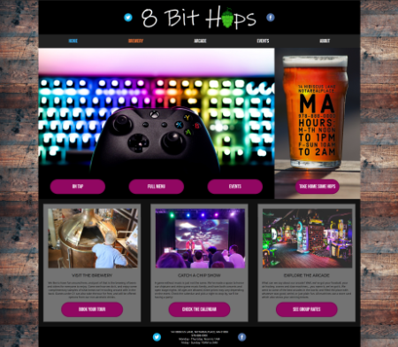
One of the first things I tried to do in designing the 8Bit Hops page, was sit down and draw out, on paper, the key areas I wanted. It was important to me to have a clear spread of information, in order to answer the "who, what, where, when" bits quickly. I prefer to be given the key information FIRST, and then once that's taken care of, I can be entertained or marketed to. So, I wanted to use the logo, navigation, and "above the fold" areas to convey the "four Ws", as well at tone and context.
The other key thing I wanted to keep in mind is where the actionable items would be found, and what behaviors they would encourage. I wanted to make sure that if this were a business, I could direct traffic to the key business areas, while I still had the user's interest. I do want to show them all the other details and fun things on this site, but we're both served by giving the user a clear path to the main content. Chances are that they're here to interact with the main aspects of the business, so the focus should be on those things. In this case, I first used the nav bar to do this.
I settled on making the Brewery and Arcade aspects of 8Bit be top level content, and decided to keep the other things (concerts, open mics, food truck schedules) under "Events" since they're all, in a way, "When" things. When the user clicks on the Brewery link, I'll take them to a page that talks about Brewery Tours (which can also be booked in the Events area with other things), the part of the site where things are brewed, and what the process is. To my mind, the brewery is the spine of the business, and the Arcade and music/entertainment aspects are there to provide personality. Still, I wanted to also include the Arcade at the top of the tree, so to make it clear that this is not just a brewery with a few machines in the corner of the tap room. This is a place where you have people who are into both things, and have worked to combine them.
I used Grid for the overall layout, but within the different areas, I used Flex to arrange things. In terms of styling, I went for all caps, easy-to-read text for the nav links, letting the logo above it do the work. However, I did use colors in the psuedo classes for the links, to still make them feel interesting and also indicate to the user that this is something they can interact with. I used this scheme in other areas, too. On the Nav Bar, the white text reacts, but further down the page, the buttons react, and use the same reaction colors for focus/hover and active.
Grid and Subgrid with Semantic HTML
Grid is something that I was shown early last fall, and I decided that I would try to get confortable using it. It's a useful tool, once you learn how to "describe" what you want to the browser with it. On this project, I used a couple "layers" of grids. There's one to create the sidebars and main content (grid-container), and then any other grids are technically subgrids of that. I've included a screenshot of the DOM as shown in Chrome on my setup, and each area that uses Grid to describe the layout has a marker that when clicked, will outline the grid on the page.
When I first started doing this, I wasn't sure how I could use Grid and also use Semantic HTML to markup the page, and it was important to me that I try, because that structure would make the page more accessible and help the browser get more specific instructions when building the page. The examples of grid that I was reading, show you using divs to deliniate different areas, and then I realized of course that you could just use the semantics and apply a class to it that was the Grid area you wanted. In the screenshot of the DOM, you'll see there are still some Divs, for areas I wasn't sure how to define. I plan to read up more on which terms are used for which areas, and see if any of that can be adjusted as I go through the other pages in the site.
It's harder to see in the screenshot, but this shows the basic layout. Banner has a subgrid, which is Image at the top, and then the tree buttons below. I made the buttons have a black background, and then trimmed the image so that the bottom edge of it was cut off in black areas. This way, it looks like the buttons are floating over the part of the image. I wasn't able to do the same trick with the Sidebar, so I instead used Flex to make the area inside Sidebar display elements along the center, and then made the position of the button absolute. This felt a little hacky, so I may try another way to make it work.
Next to work on
I'm going to work on taking areas of the home page, and turn them into library objects. This will help me create a template for other pages in the site, so when I put them together I can focus more on the content. I also need to read more about media queries and try using one to make the content on the main page (and possibly others) shift better on a smaller screen. I'm not sure if I'll be able to, but I have a grid layout for a mobile view that I'm going to try to impliment if it will let me. This would be a single column layout with one or two main call-to-action buttons, and an area with the hours and contact info, then additional flavor content below. Then, I'm going to try my hand at making a nav bar that has buttons dropping down for the full site navigation. This will probably dip into the javascript I'm learning in my other class, and when I'm mapping out the internal content for the site I can build the navigation tree at the same time.